Choosing a colour palette for your home is probably one of the most important decisions you will make. The colour scheme of your home dictates the mood, vibe and overall aesthetic. The best question to ask yourself is “Why are we making the change?” Repainting a room, or your entire home could be because the colours were too dark or overwhelming, or maybe you just want some change. In any case, keep whatever didn’t work in mind to avoid making the same mistake.
It goes without saying that you should be thinking about your colour scheme in the planning phase of your renovation project. Once you have a color palette in mind, the rest of the pieces just seem to fall into place. Now let’s talk about the steps involved in the selection process.
Step 1: Befriend the colour wheel

The colour wheel sorts colours into their natural blend and contrast. When you look at the colour wheel consider tints, tones, and shades. Tints means white has been added to a colour, tones means grey has been added, and shades means black has been added. You will be exposed to a variety of colours so play around with them, mix and match the colors and test what they would look like in a certain room. The goal is to end up with 3 colours, the primary, secondary and accent colour.
Step 2: Decide on how you will use the colour wheel

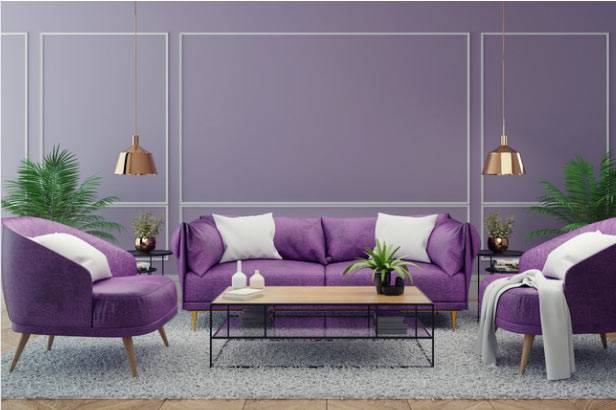
You can choose from one of 3 ways of using the colour wheel to choose your 3 colours. The first method is monochromatic. This means you will pick one colour as a primary colour then use its tints and shades for your secondary and accent colour. The second method is analogous. With this choice you select colours that are next to each other in the colour wheel for a slight contrast. The last way is complementary. Complementary colours lie opposite in the colour wheel and provide the most contrast.
But, how can you decide between the three? You could start by looking around the room for inspiration. If you have large furniture, or an area rug, or any statement piece in the room, you would have to consider colours that work well with it. Need a few more tips?
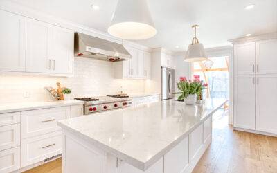
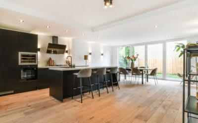
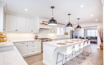
Tip 1: Always start with bigger rooms that people will first enter and work outward. These include the entry-way, dining room, kitchen, and living room. Once you have a colour scheme set for these areas, you can create a transition to other rooms. Neutral colours like black, white, and grey are great for transition areas because they allow the eyes to rest.
Tip 2: Treat the upstairs and downstairs separately. If you have two levels in your home, treat them differently. Children’s rooms tend to be more bold while adult rooms may be more subtle. If you have a master room, remember to make the bedroom and bathroom look like they belong together. A monochromatic palette would be great for this.
Tip 3: Last but definitely not the least! Light has an effect on colour. Always consider what effect natural and artificial light will have on your colour scheme.
As The Bradburn Group of Companies, we have handled many renovation projects ranging from residential to commercial. If you’re looking for experts to help you out with your renovation project, reach out to us, the Bradburn Group, and let the professionals make your project seamless and stress-free.